Minimalist initial signatures
Two thin strokes and generous space around them, with nothing added for the sake of looking finished.
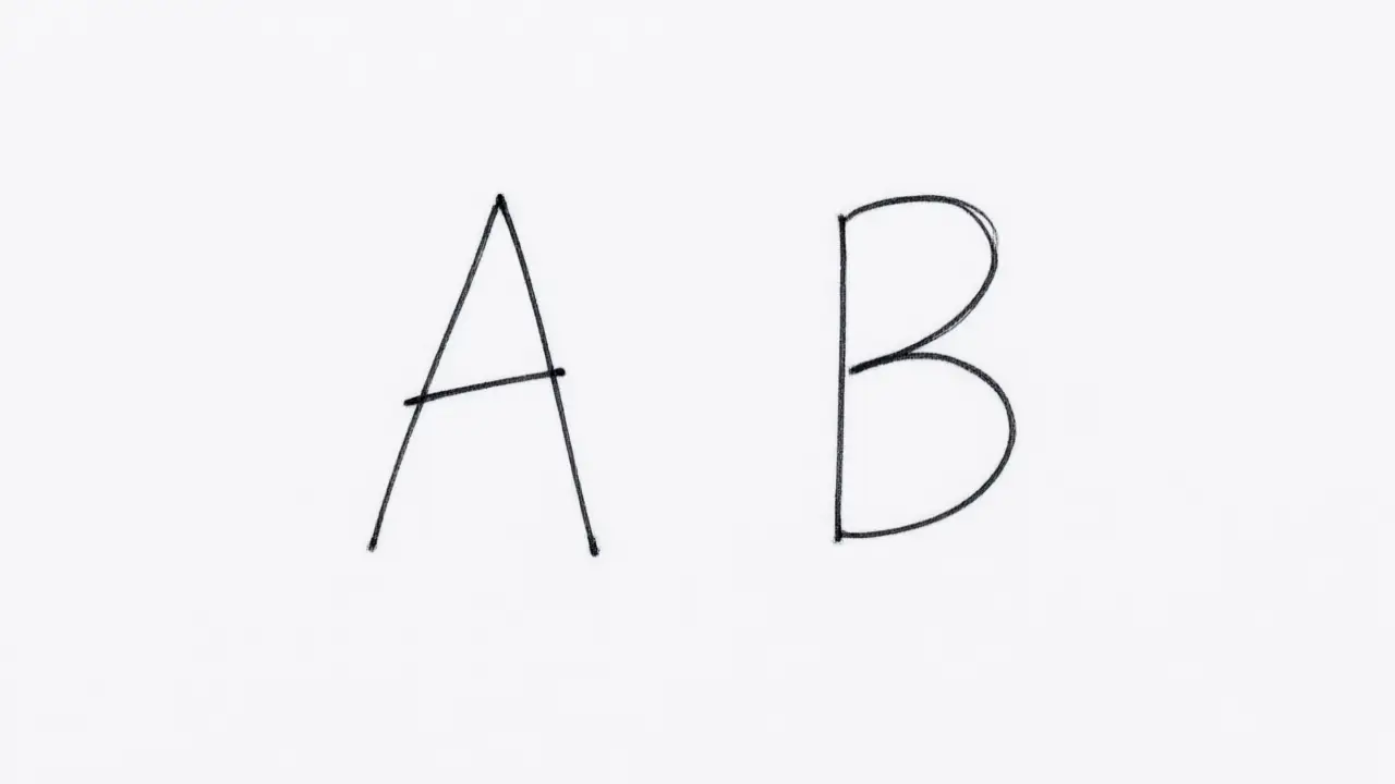
A minimalist initial signature keeps only what identifies you: two clean strokes, no serif, no underline, no connecting flourish between them. What looks unfinished on paper often reads as deliberate once it sits inside a printed form.
Which letters earn their place
Two letters is the usual answer, three when your name is common. Minimalist initial signatures work because the reader is not decoding anything: they are recognising a shape they have seen before, at the bottom of a page they already trust.
Because there is so little to it, spacing does most of the work. Two initials pushed close together read differently from the same two letters given room to breathe, even though the letters themselves are unchanged.
Make the short mark hard to copy
Anything short is quick to imitate, so the defence is not length but habit: an unusual join between the letters, a fixed baseline, a stroke that always ends in the same place. Consistency is the part a copyist cannot see.
This style depends on a steady hand more than an elaborate one does — there is nowhere for a shaky stroke to hide behind a flourish, so the two letters have to be genuinely consistent every time.
Where initials work best
Initials belong where space is short and repetition is high — initialling each page of a contract, marking a drawing, signing off an internal approval. For a first signature on a legal document, most people still want the full mark.
You can build any of these online: open the signature generator, draw or type your name, and place the result straight onto a PDF or Word file. Nothing is uploaded — the document never leaves your device.