Stacked initial signatures
Placing initials on top of each other instead of side by side saves horizontal space and reads as a single mark.
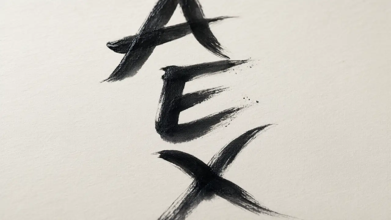
Stacking initials vertically instead of writing them side by side is useful exactly where a signature field is wide but short — a narrow column, a small corner, a compact stamp-sized space.
Which letters earn their place
Two letters is the usual answer, three when your name is common. Stacked initial signatures work because the reader is not decoding anything: they are recognising a shape they have seen before, at the bottom of a page they already trust.
The two letters need a shared vertical alignment or they read as two separate marks rather than one signature. A shared baseline, or a light connecting stroke between them, holds the stack together.
Make the short mark hard to copy
Anything short is quick to imitate, so the defence is not length but habit: an unusual join between the letters, a fixed baseline, a stroke that always ends in the same place. Consistency is the part a copyist cannot see.
It is a less common style, which cuts both ways: it stands out, but it can also need a moment’s explanation the first time someone unfamiliar with it sees it on a form.
Where initials work best
Initials belong where space is short and repetition is high — initialling each page of a contract, marking a drawing, signing off an internal approval. For a first signature on a legal document, most people still want the full mark.
You can build any of these online: open the signature generator, draw or type your name, and place the result straight onto a PDF or Word file. Nothing is uploaded — the document never leaves your device.